

Last week, we looked at using a favourite painting to establish a colour palette for our interiors. This week we’ll look at other approaches to choosing colours.
We know the basics of selecting a colour palette. We do that everyday, when we choose the clothes we wear and the accessories we carry. The colours of our clothing are chosen for their ability to flatter us, to convey to the world an image that we wish to convey, and to match the occasion and our location. They are matched with our fixed colours – skin, eyes, and hair – and the variable colours – the environment we expect to be in, such as an office, a wedding, a beach party, and so on. Evan those of us who think we’re not particularly fashion conscious know not only the “safe’ colours to wear, but even the shades of those colours that suit us.
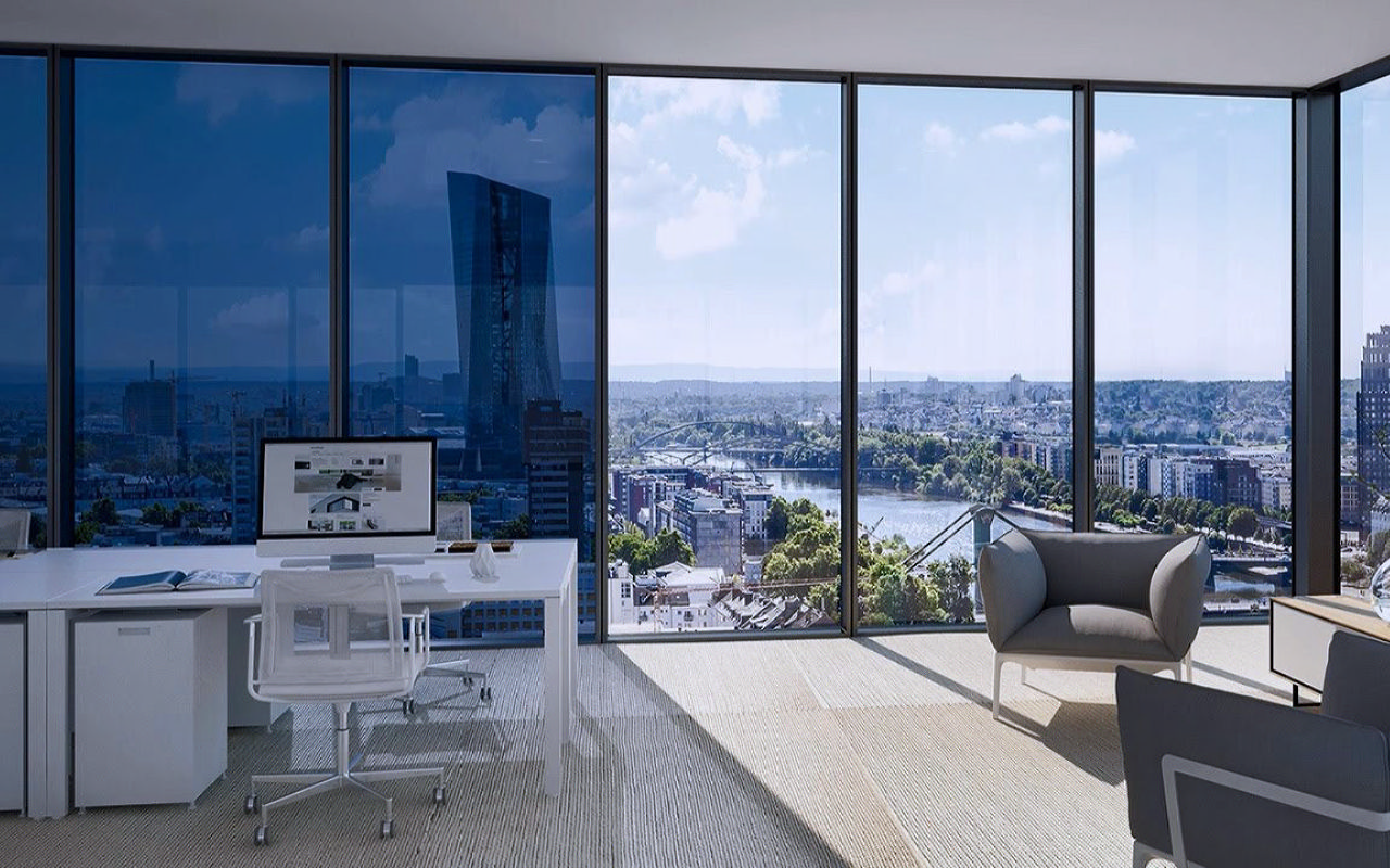
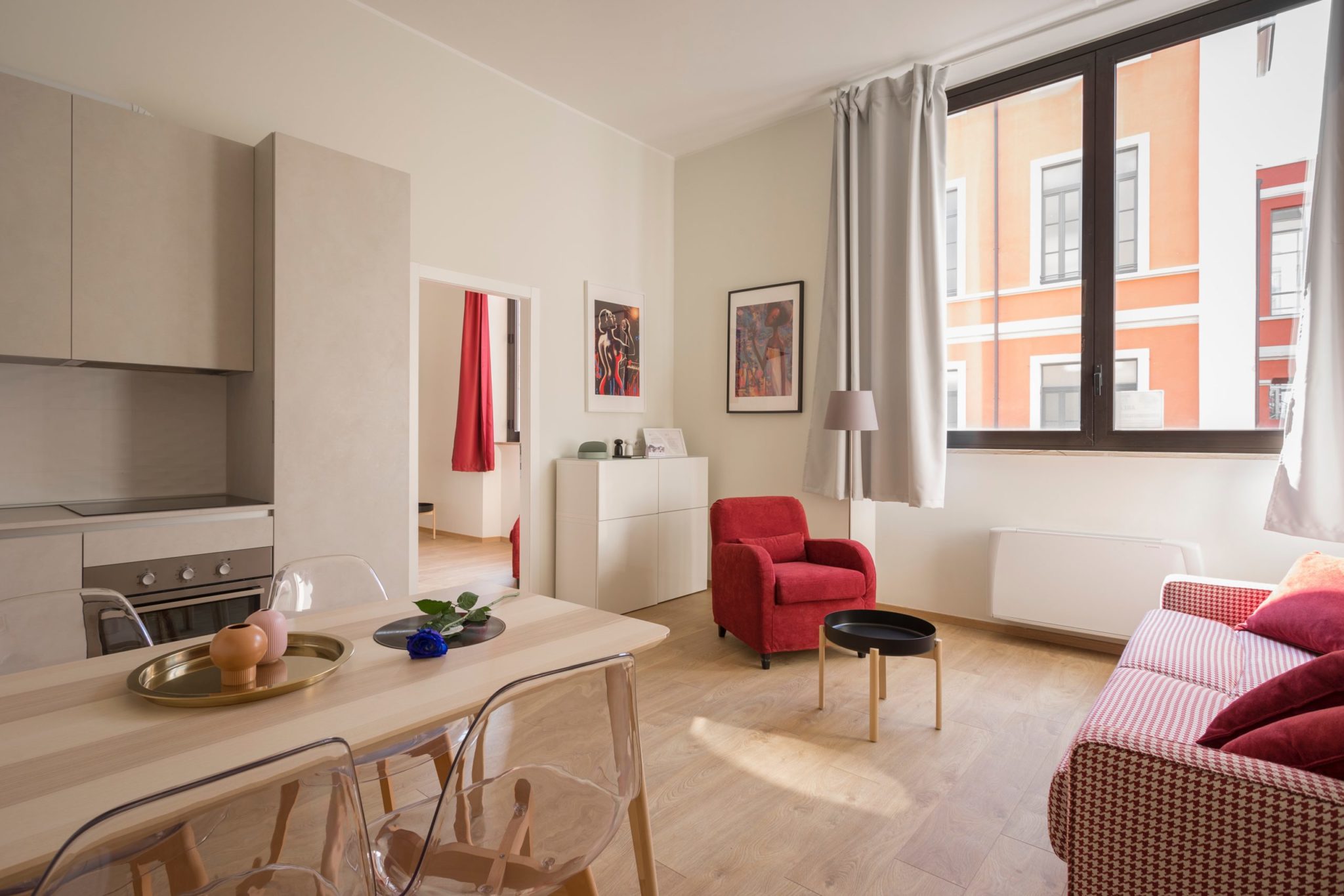
Similarly, when we choose colours for a room, we need to keep in mind the following elements
- Room colours are fixed. Unlike our clothes, we can’t change the rooms colours easily.
- There are two distinct lighting sources (at the very least) for every room – daylight during the day and artificial lighting at night. Lighting affects colours, so we need to keep in mind what people will see at different times of day.
- The areas are large – expanses of wall, furniture, upholstery, bedlinen. This has one odd side-effect. When we work with such large expanses of colours, not every item needs to be from a complementary colour palette. Odd colours can be perfectly in harmony in a room if they’re in proportion.
- Fields of vision – colours can be used to manipulate and direct the field of vision. Not only can you direct the eye to look at a particular part of the room, you can also make things seem larger, smaller, taller, wider and so on.
As an example, let’s look at this property in Delhi. As part of an independent house, it offers that rare thing in a Delhi homestay, greenery.
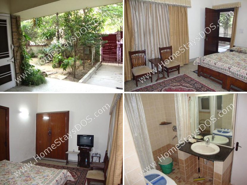
The lush green entrance catches the eye as you enter. Why not use this as our basis for the colour palette? Make your homestay look as fresh as your garden.
For the first option, we’ll look at taking the outdoorsy beige palette indoors, with an accent of green.

Implementing this palette would give us something like this:
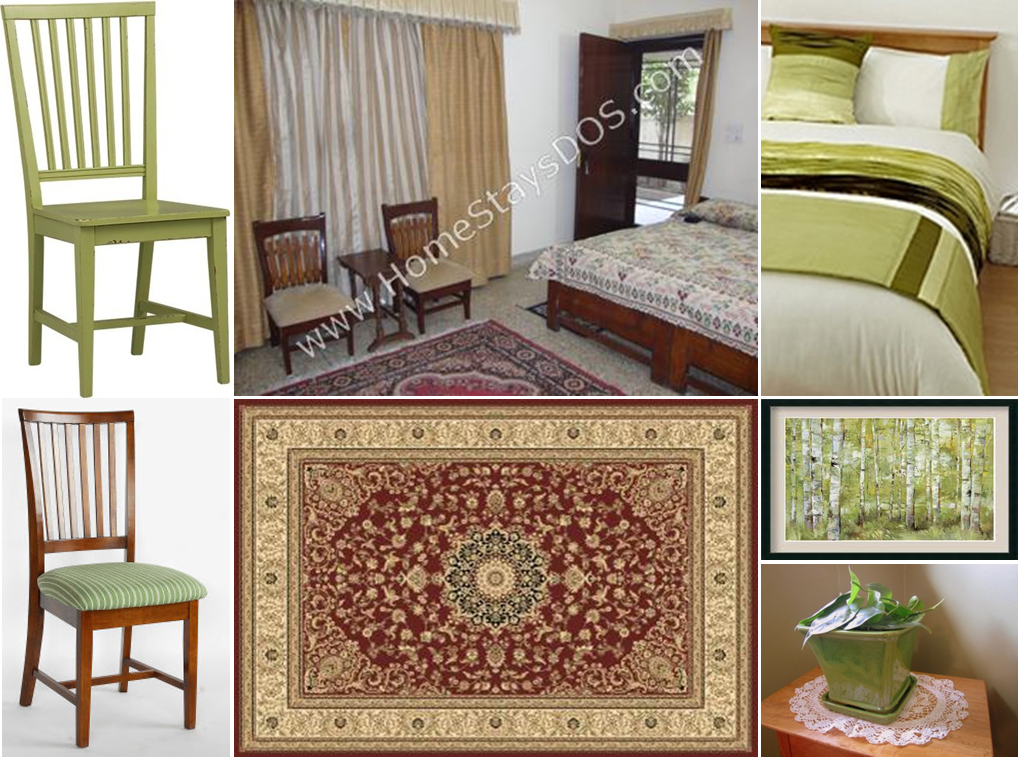
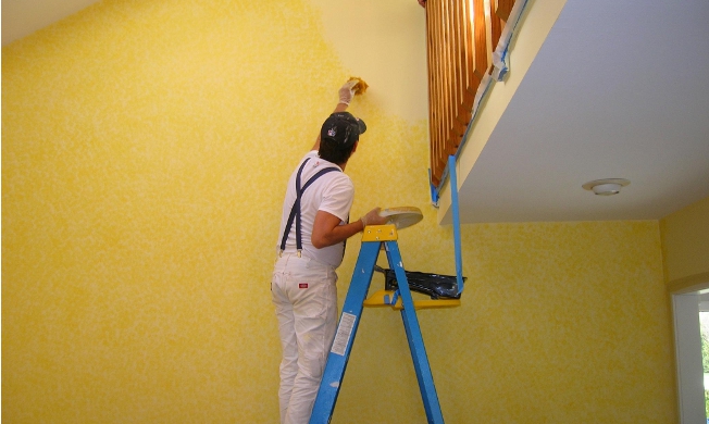
The existing Kashmiri carpet has a blue base. It should, instead, have a yellow base, as above. Instead of the chairs being in the same monotonous beige, use the accent colour. make the chairs green, either by changing the upholstery or by painting them, as in the picture. Add a little accent of green to the bedlinen with cushions. And finally, bring the green outdoors in with a nature-based artwork and a potted plant on a console.
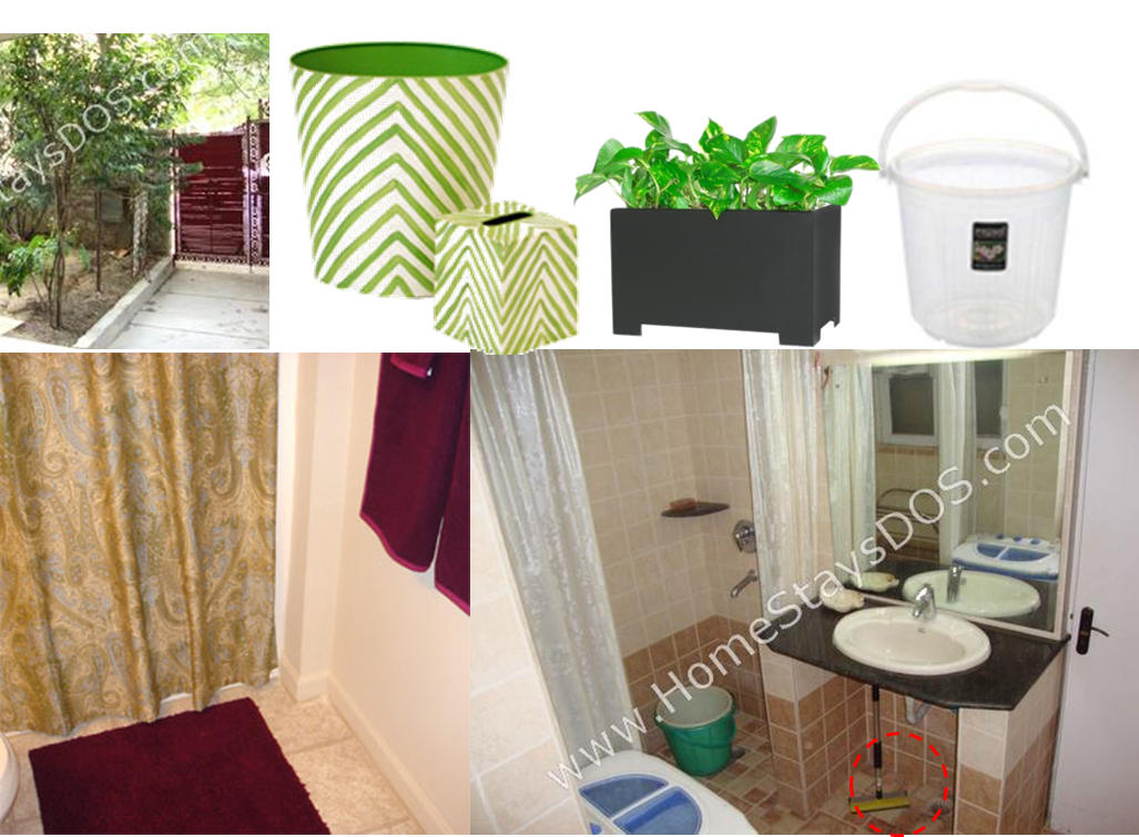
As for the bathroom, the dull beige of the bathroom can be made fresh and appealing with a few cosmetic changes:
- Always use transparent buckets and mugs, if you have to, in the bathroom.
- Use the accent colour for the shower curtain.
- In this case, use the gate colour, maroon, for the bathlinen
- Hide the bottom of the vanity counter with a waste basket or a rectangular planter with artificial plants, in the accent colour.
In case you’re not comfortable with an accent colour, and want to stick to tints and tones of beige, you could go with our second option:
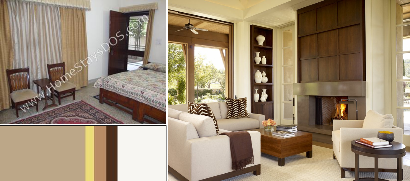
If you stick, strictly, to tints and tones of beige, without any accent colour, you could get interiors like the picture above right. It’s much more difficult doing this, as you have to resist all temptation to introduce other colours into the palette.
Would you like your property featured in these stories? Write to us and tell us why.
To get more information & assistance, please submit the form below and our specialist will get in touch with you at the earliest.

