This week, we look at the living and dining areas in a lakeside property in Bhopal. This is a very curious property indeed. It has a great location and is so spacious that you could call it grand. It’s filled with expensive carpets and accessories, but it appears that the objective was to fill the space, not present it to its best advantage.
If you have living rooms large enough for two sets of seating, then you should zone them by activity. One zone could be an activity that reflects your lifestyle – watching television, listening to music, reading, a dedicated gaming station, and so on, and the other a formal seating area for receiving guests. When both sets of seating appear to have the same purpose, then the feel of the place changes to a business lobby rather than a home.
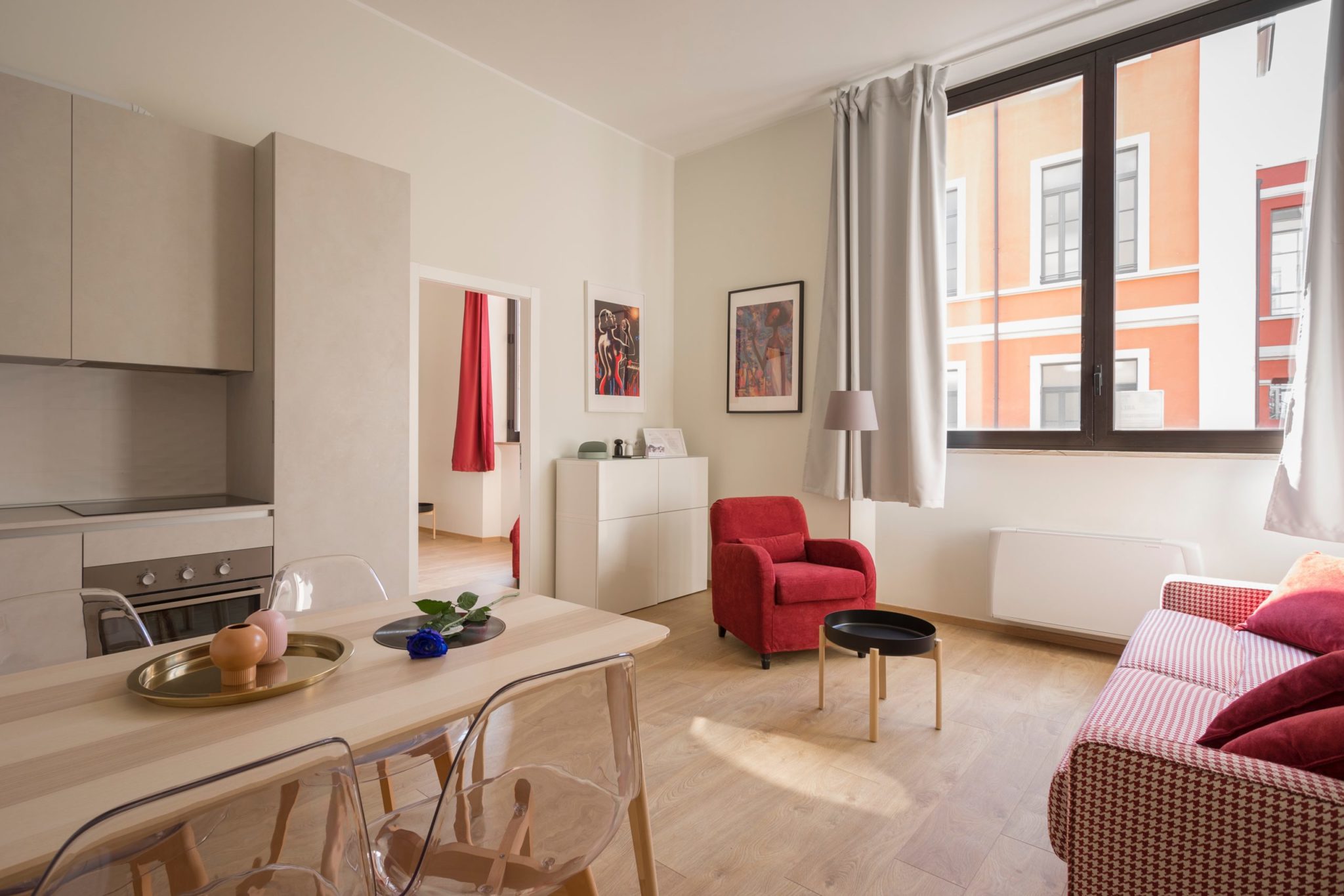
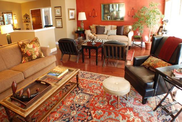
The carpets in this space are large and rich, and define the two spaces clearly, so all that is necessary in this room is to de-clutter. And please – no toys, bags and random pieces of furniture. For example, take a look at this picture. This room is very similar, but the spaces are defined clearly, and the lack of clutter makes it more appealing.
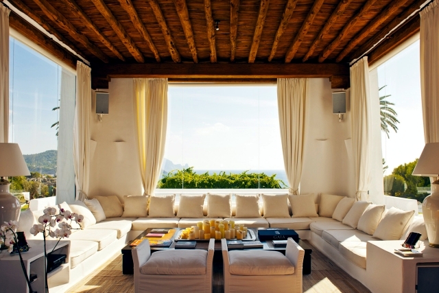
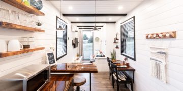
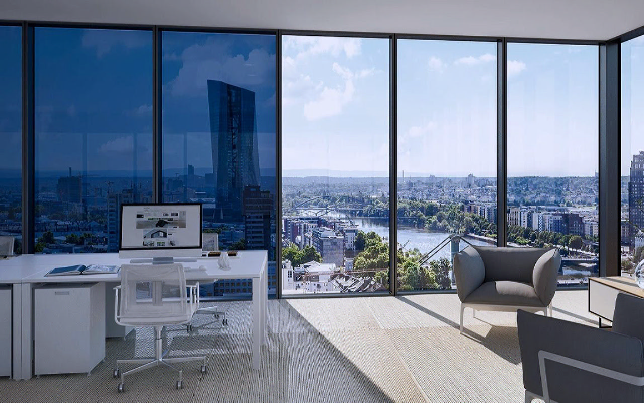
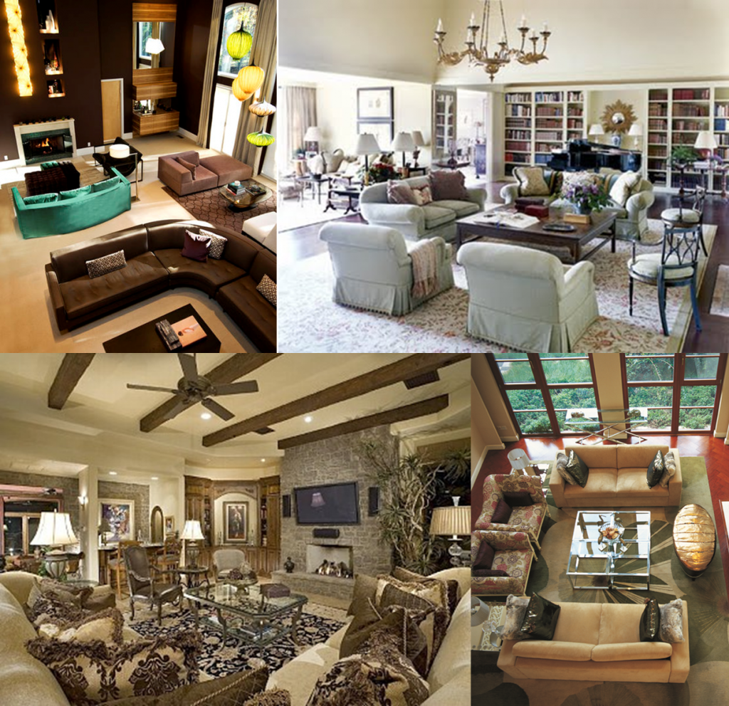
When you have such large living spaces, there is great potential for interesting design. Look at the following pictures to see how large furniture pieces, such as a long “L” sofa or a full built-in bookcase transform a room. A feature wall or full windows can also provide a focal point and unify the room.
An understanding of symmetry is essential for furniture placement, and especially so if you want an asymmetric arrangement! This wall below, for example, has nothing planned.
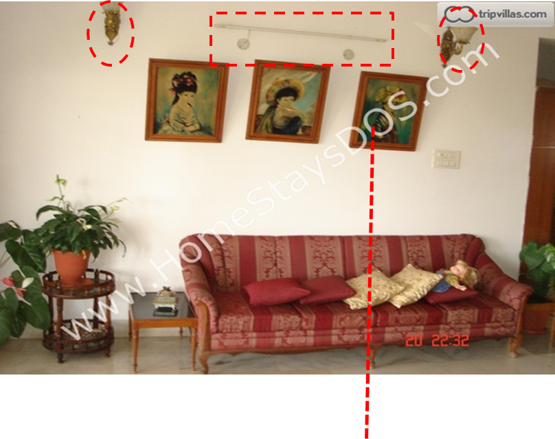
This visual chaos is caused by not aligning the sofa’s centre line with anything else in the picture. There are two mismatched wall sconces around a bare tubelight. The three pictures are not aligned to each other or anything else. The three potted plants contribute to the chaos, as do the cushions and toys thrown on the seat.
It’s not as if this property has all misaligned seating. The other wall in this room shows how it’s done.
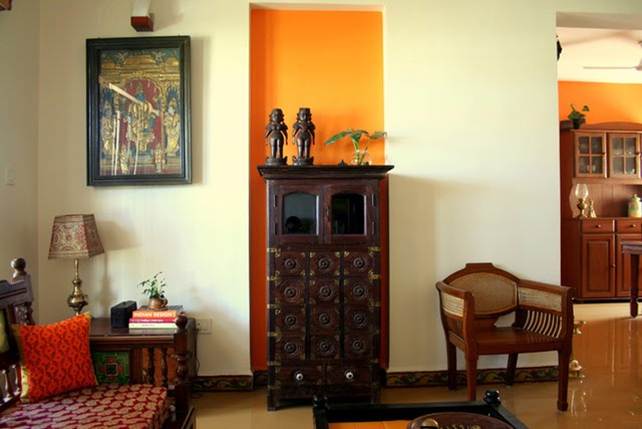
Notice how the pictures are aligned to each other and to the sofa? If you would prefer an asymmetric layout, set one strong element and place the other items around it, as in the following picture.
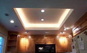
By the way, bare tubelights are industrial lighting, never to be used in a home. If at all you do need to have a tubelight at home, and there’s no reason with with the availability of warm CFL bulbs, please have it hidden away in a bulkhead or in a decorative fixture so that no one ever sees the bulb, as shown here.
The picture below should be the picture that defines and highlights the property. Unfortunately, it’s a poor picture. When cameras are set to automatic exposure settings, they compensate for the brightest areas of an image. In this case, it’s the windows, and in order to get some detail in the window, the rest of the image is badly exposed. One could also turn off the date and time stamps (which are set wrong in any case) before taking the picture.
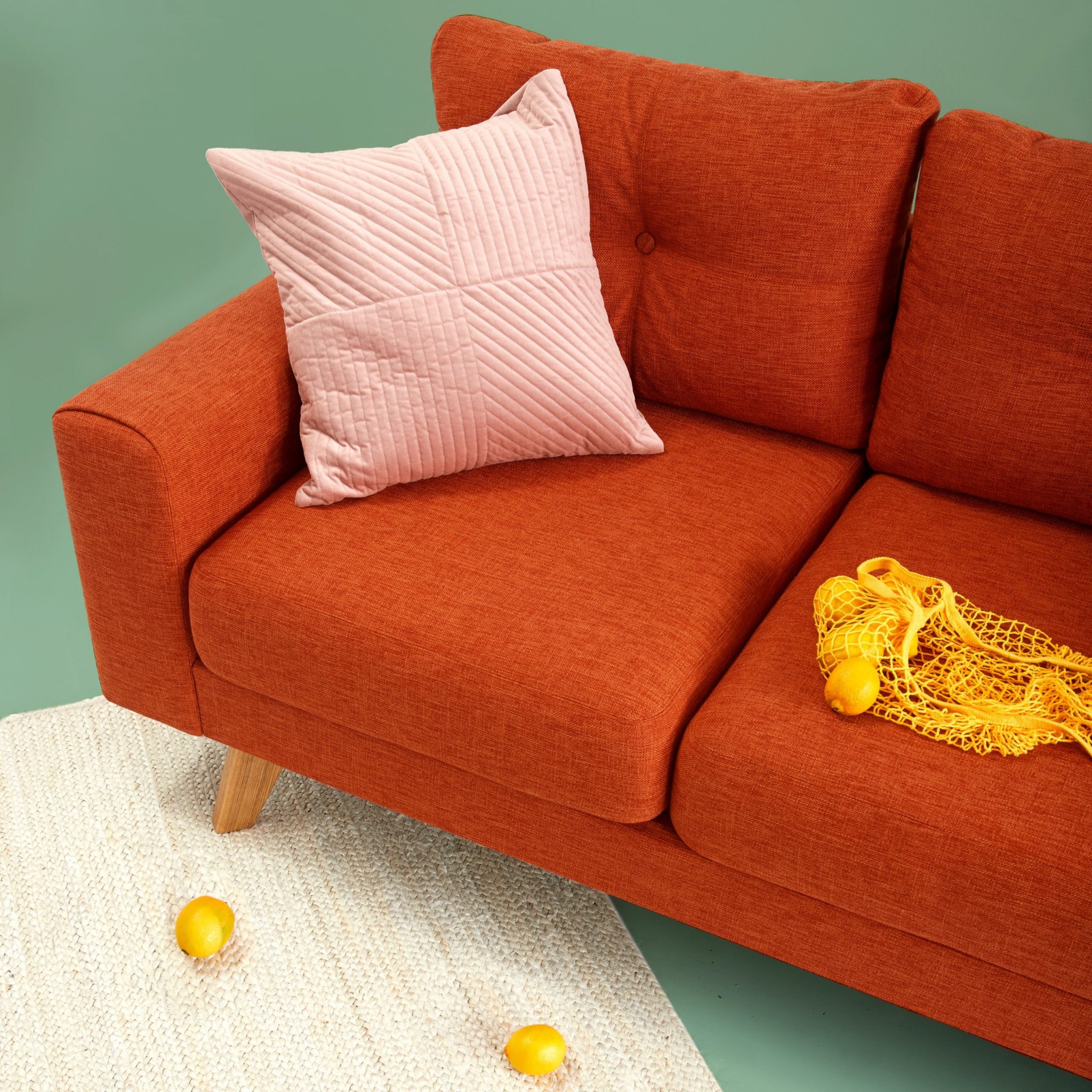
Now for the interior fixes – Never set cushions on their corners. The corners get squashed, and the arrangement is unstable. Cushions should be set like this:
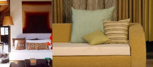
How do you select cushion covers? It depends on the look that you’re trying to achieve. If you have a formal living room, pair the cushions to the sofa fabric.

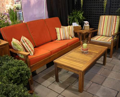
For an informal, comfortably cozy feel, use assorted cushions.
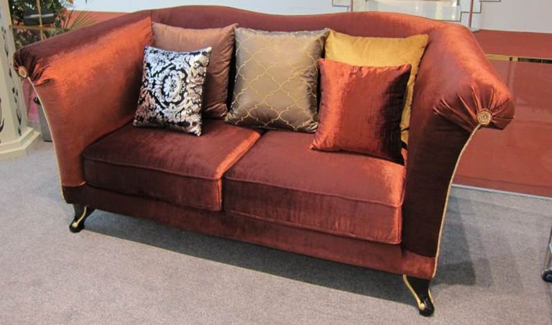
For the hip, eclectic, look, match the cushions with the fabric of the other sofa.
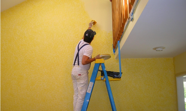
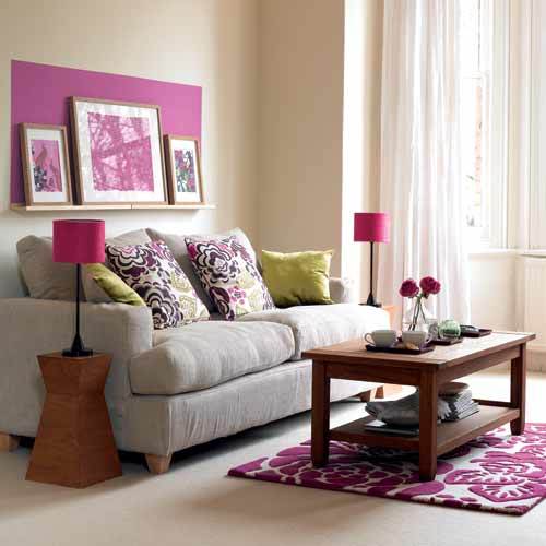
As far as the pictures on the wall go, it’s not absolutely essential to hang pictures on the wall. A narrow shelf does perfectly well, and if as in the picture below, you choose to highlight the pictures with a patch of paint behind, it looks even better.
Next week, we look at lighting in this room, as well as the curtains that the room deserves.
To get more information & assistance, please submit the form below and our specialist will get in touch with you at the earliest.

