

We often get queried as to how much color do you need to use in order to have any space looking nice while not assaulting the senses. The simplest rule to always fall back on is the 80/20 rule. This is one of the universal design rules and is used not just for interior design but for a lot of areas that play on the visual senses – a good example would be Print Advertising as well as Art.
To summarize: Use 80% Neutral colors and 20% Accent colors for any space.
Whenever you are designing a space, first focus on the neutrals. If you have been conservative when buying your furniture, you would most probably already have a room that primarily has a neutral palette. You can then worry about just accessorizing to make up the 20%. A good idea to remember there is to not waste the 20% by fragmenting it among multiple clashing colors.
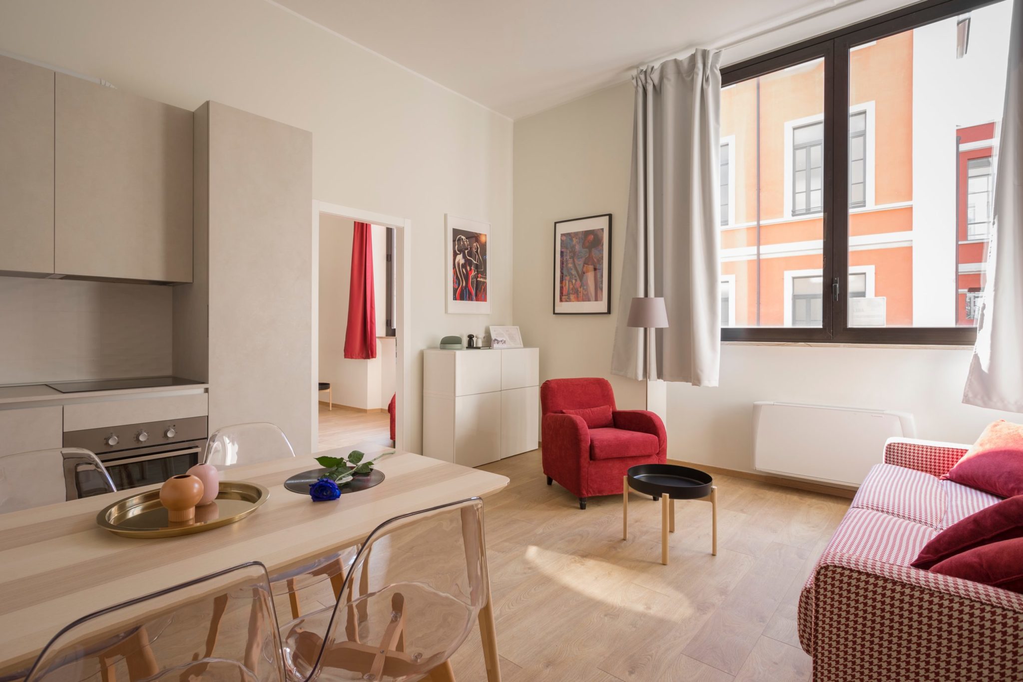
A good example is this image:
As you can see the 20% color is provided by the oranges, the Green plants in the background and to a lesser extent the red book. This is a composition that is brutal in it’s elegance and minimal in color. It’s best used only for the most expensive residences and where no expense has been spared in the materials in use.
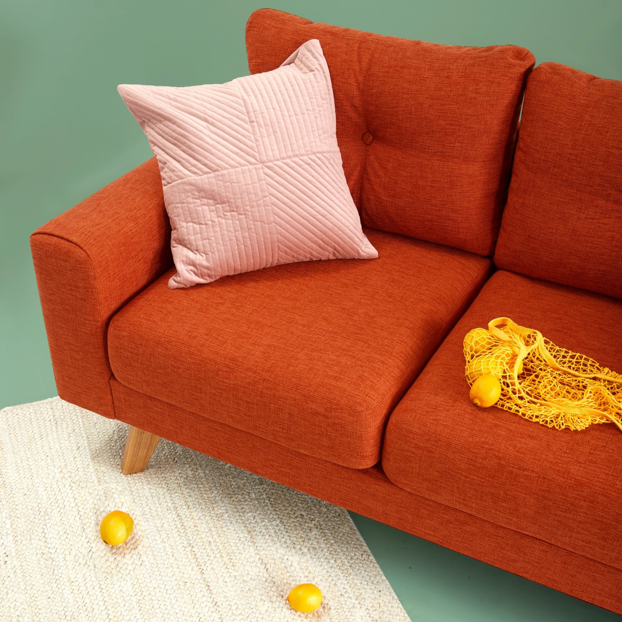
Another Good example is the following:
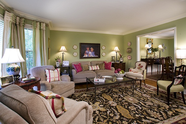
This is a Living room that is bold – it uses colors that many would shy away from but yet remain in the neutral territory with the 20% color being provided by the cushions and the focus family portrait in the center.
Good Neutral Colors include Beige, Grey and Slate. These can be used as the foundation for your 80% with most neutral shades of wall paint providing some warmth.
How does the 80/20 rule translate to Dining rooms?
The most important thing to keep in mind is that Dining tables usually are best accessorized with fresh flowers or Fruit. These will add color and so it is best to ensure that your table and chairs are neutral to make up the 80. You can also use neutral accessories knowing that you will have fruit or flowers within them to add to the look.
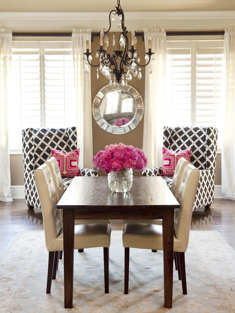
A good example
Notice that the lovely wingback chairs provide some contrast but not too much color – that’s really what the flowers are doing.
Please send us your comments and photos on what you’ve been experimenting with – we’d love to see. We’ve also put together some products below that we spied on the internet and thought you would enjoy. These are from a new store called UrbanLadder in India – We love what they’re doing and will feature some more products soon.


